Nanni
Audience
Over 25k monthly caregivers
Team
Startup : pre-seed stage
About
Nanni is a mobile app that predicts why a newborn is crying, using a
hyper-accurate algorithm, while also offering caregivers the abilty to create & follow a
healthy sleep schedule.
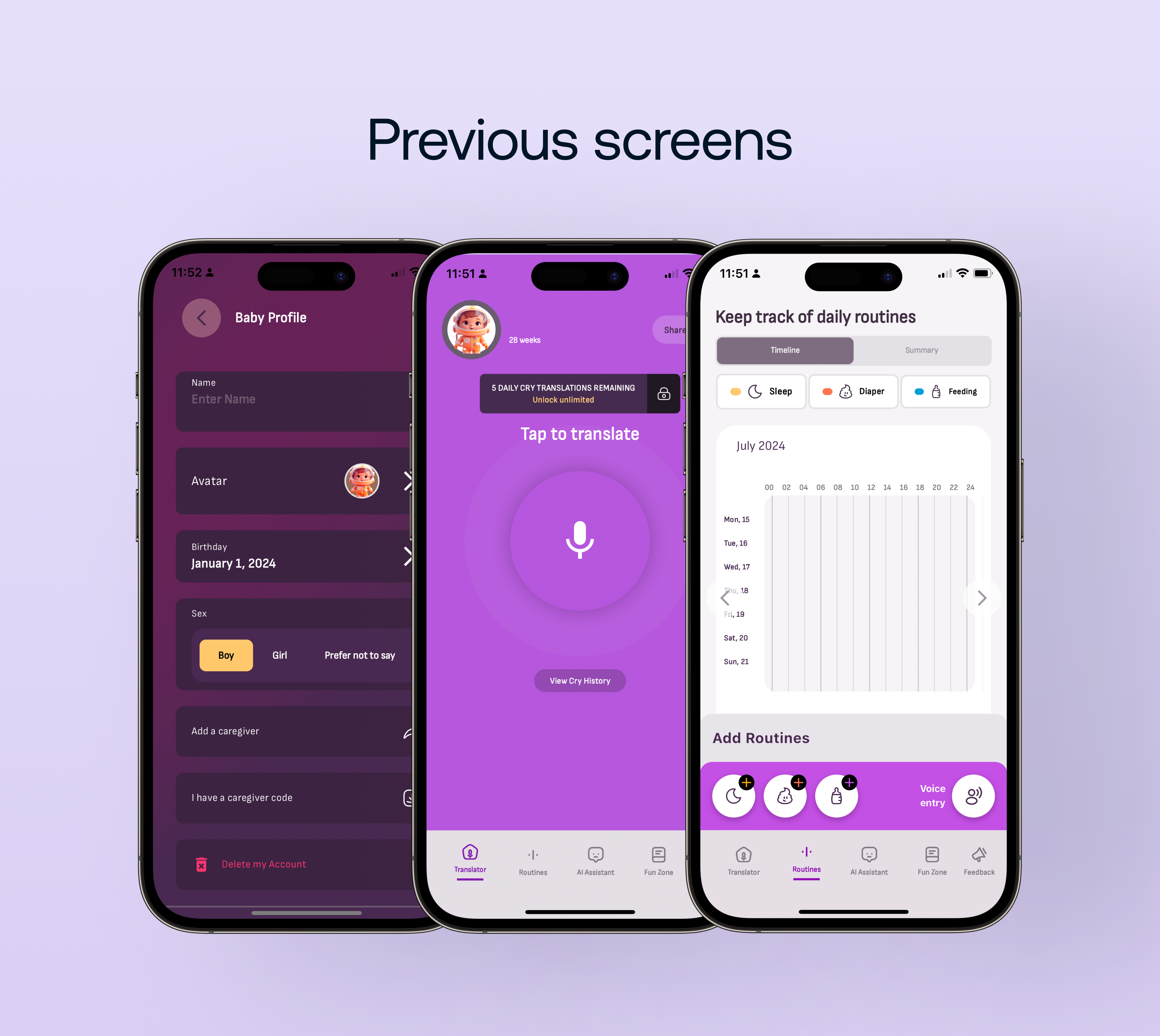
While the application was performing well, Nanni found through user metrics and interviews, that
users were having issues performing tasks inside the application. It was also brought to Nanni’s
attention that they were being seen as an entertainment application, rather than the science backed
healthcare application they originally positioned themselves as.
– I worked with Ubenwa to redesign the application with a focus on product clarity &
brand maturity.
Goals
A. Organization
With the launch of new key features, and a growing base of users, the application had become
cluttered and difficult to navigate.
I would focus on organizing existing elements into a clearly defined hierarchy, while leaving
room
for new features coming down the road.
B. Maturity
Nanni is backed by scientific research, and uses pediatric science to provide tools for
caregivers.
We wanted to make sure the application relfected this.
C. Maintain the fun
While a redesign was inevitable, there was no need to remove the "fun" from the product. A
balance
needed to be struck between keeping the product fun for caregivers, while also clearly defining
itself as a useful and usable tool.
Navigation Menu
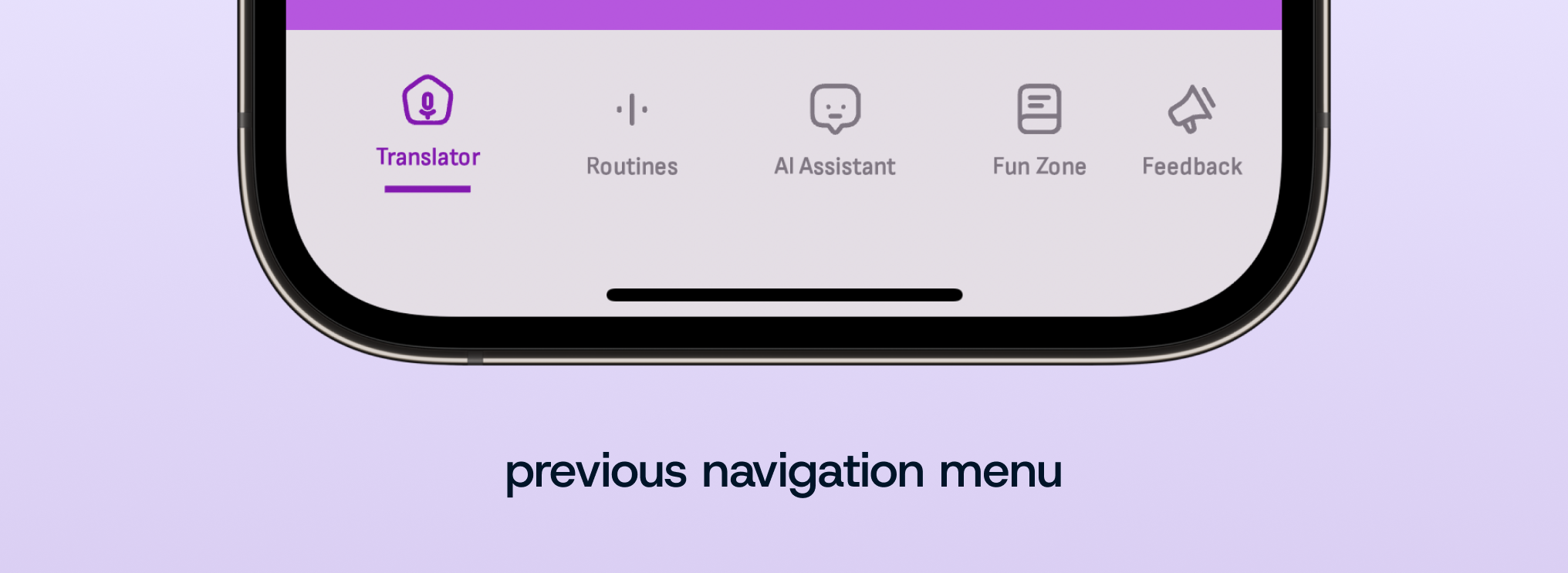
Listening to both the audience and the internal help team explain
their confusion and problems with navigating the application, we found three repeated issues.
"I often miss a babies cry because it takes multiple taps to get to the recording
screen."
"Routines is confusing. I forget where to go to see all my recordings."
"Users are not submitting feedback from the feedback screen, 90% of the time it's from
the results screen."
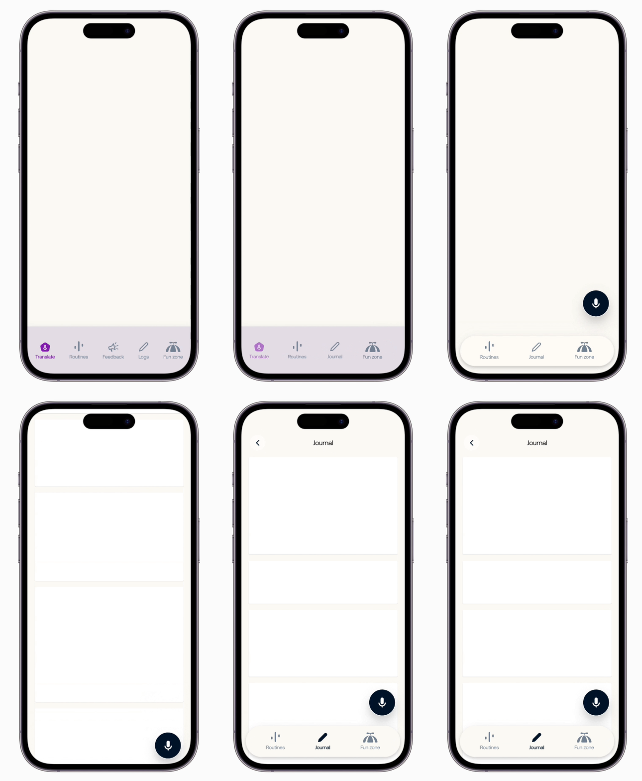
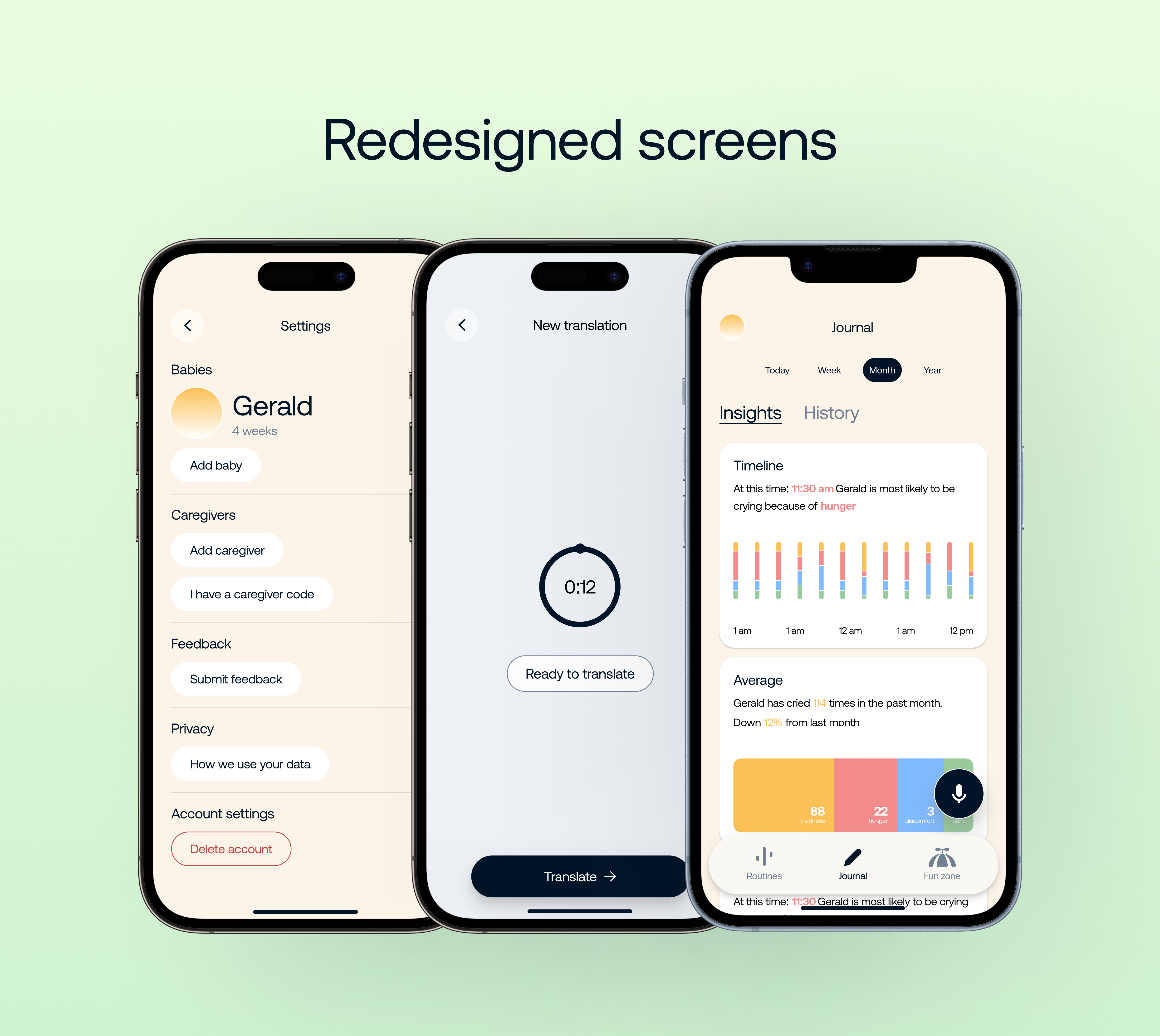
The navigation menu went through several iterations, with intention to minimize
actions, and prioritize recording a newborns cry.
– Feedback was moved to more pertinent locations across the experience, garnering more
direct
feedback
from caregivers.
–Logs were renamed as Journal, found to be more of a human representation of the feature.
– Translation became a floating action button, allowing caregivers to have instant access across the
application, and never miss a cry or journal entry.
– The navigation menu itself became a floating bar, that got out of the way when the user was
interacting with content across the experience.
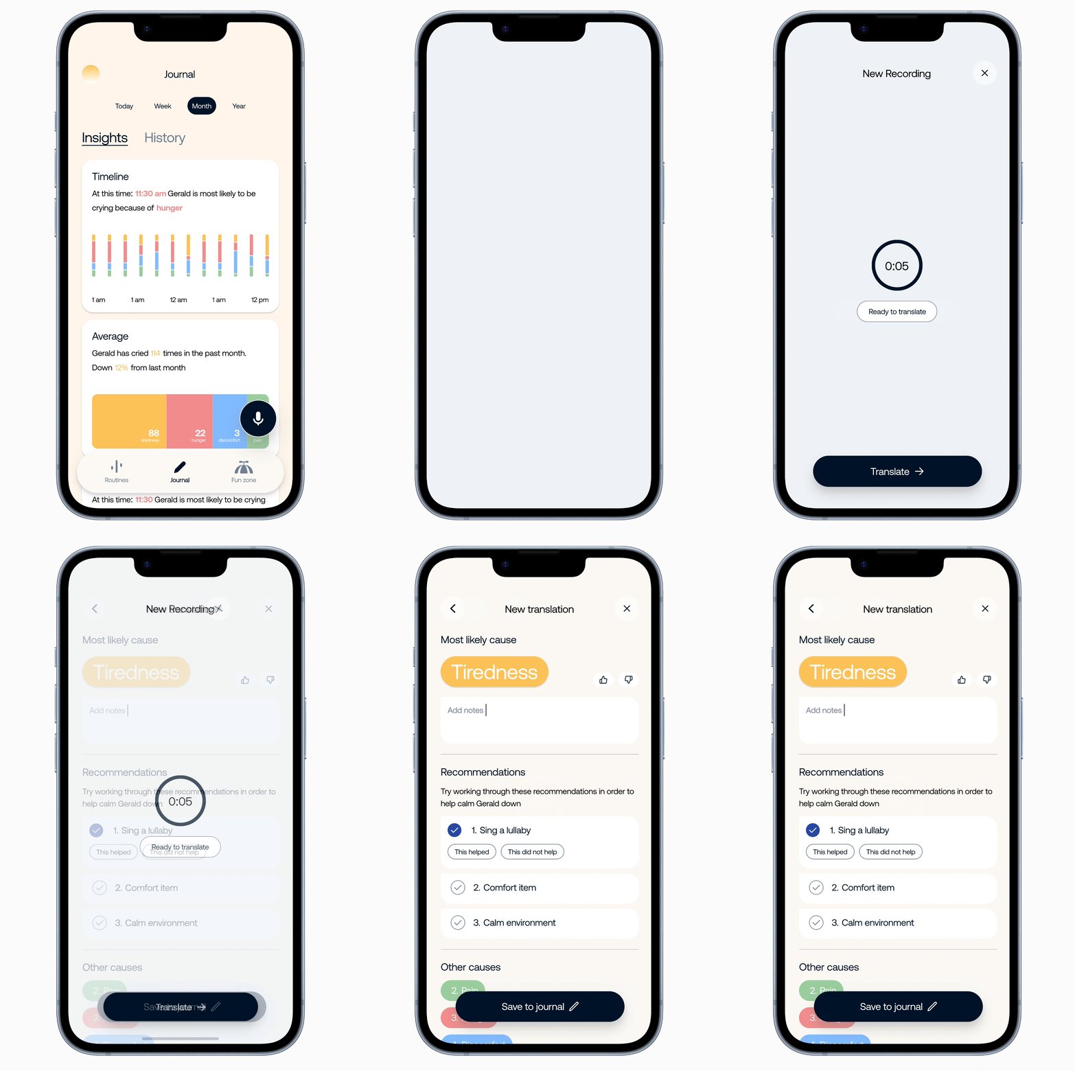
An easy access translation flow
– With one tap, from anywhere in the application, Nanni's audience was able to record
a cry.
Other feature changes
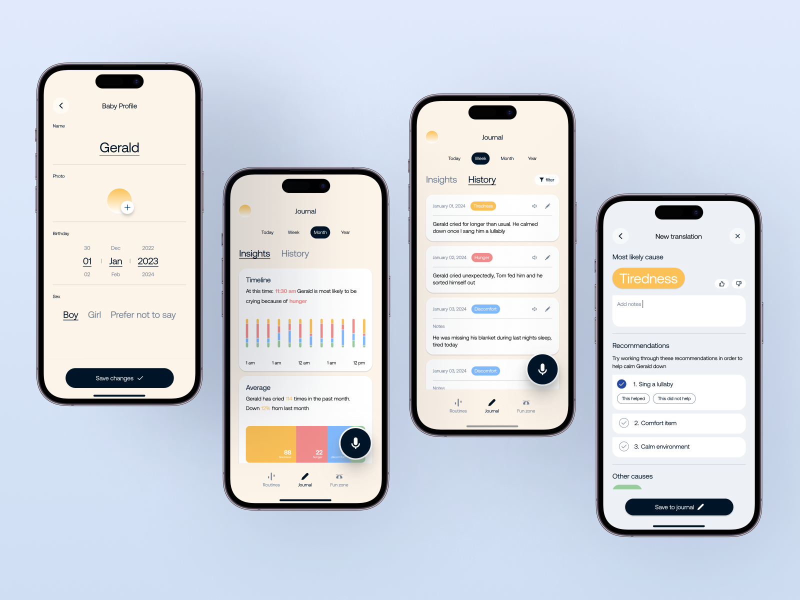
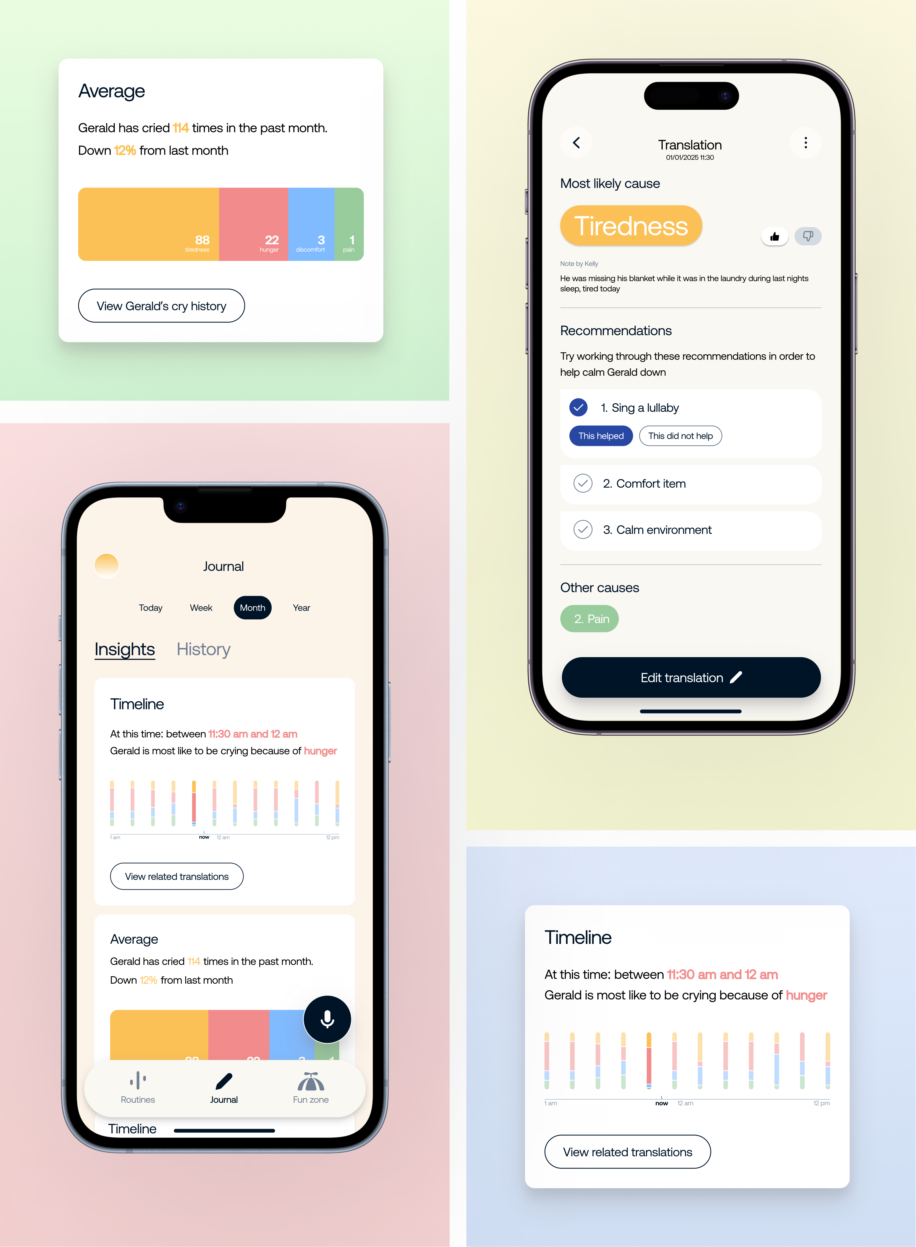
Routines went through a transformation and became Journal, a home for all recorded cries.
Split into two tabs, Journal matured into a space where caregivers could glean insights, and view their
history.
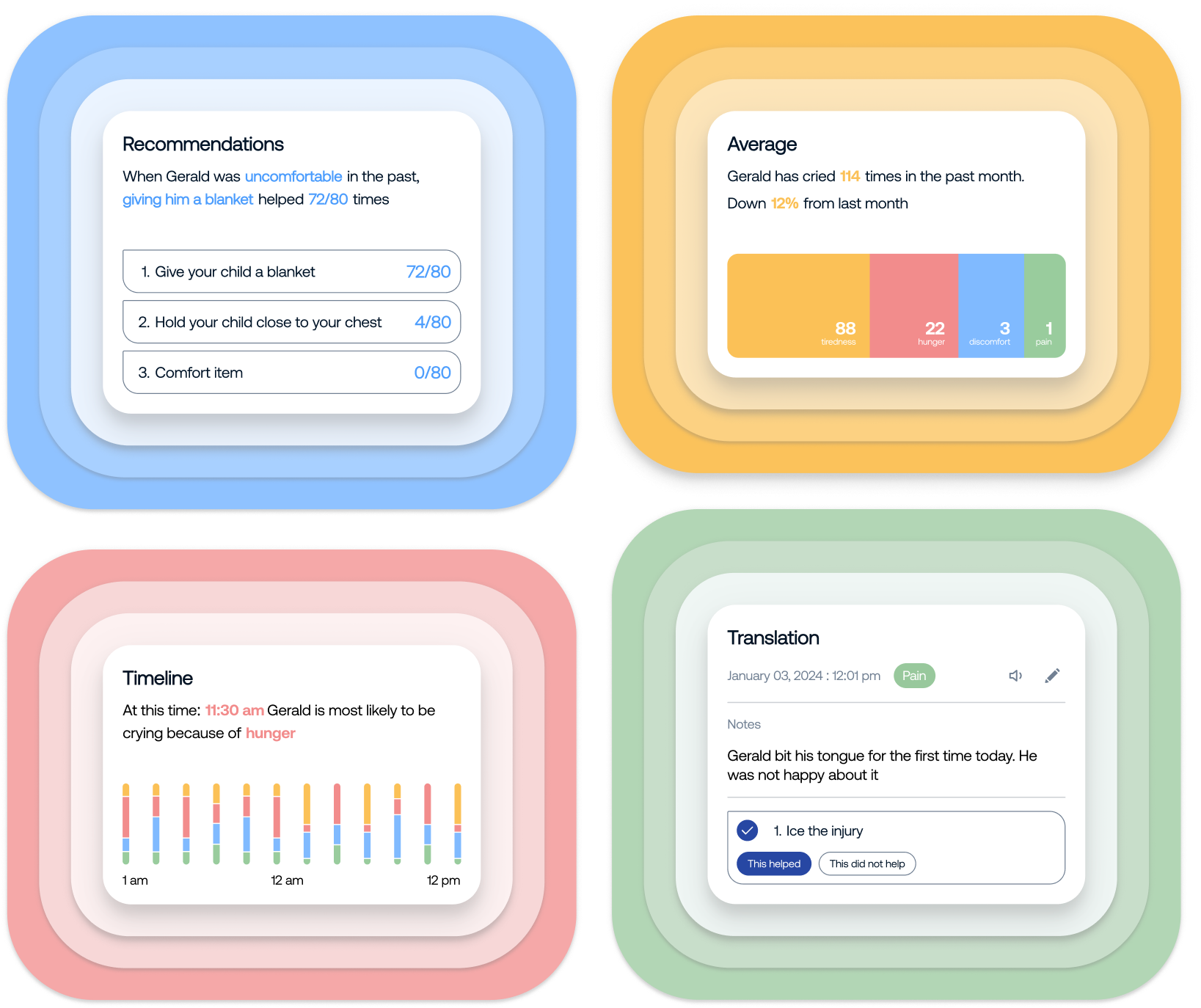
Journal : Insights
Caregiver's recorded cries generate insights, allowing them to further understand
causes, trends and averages across their newborns data.
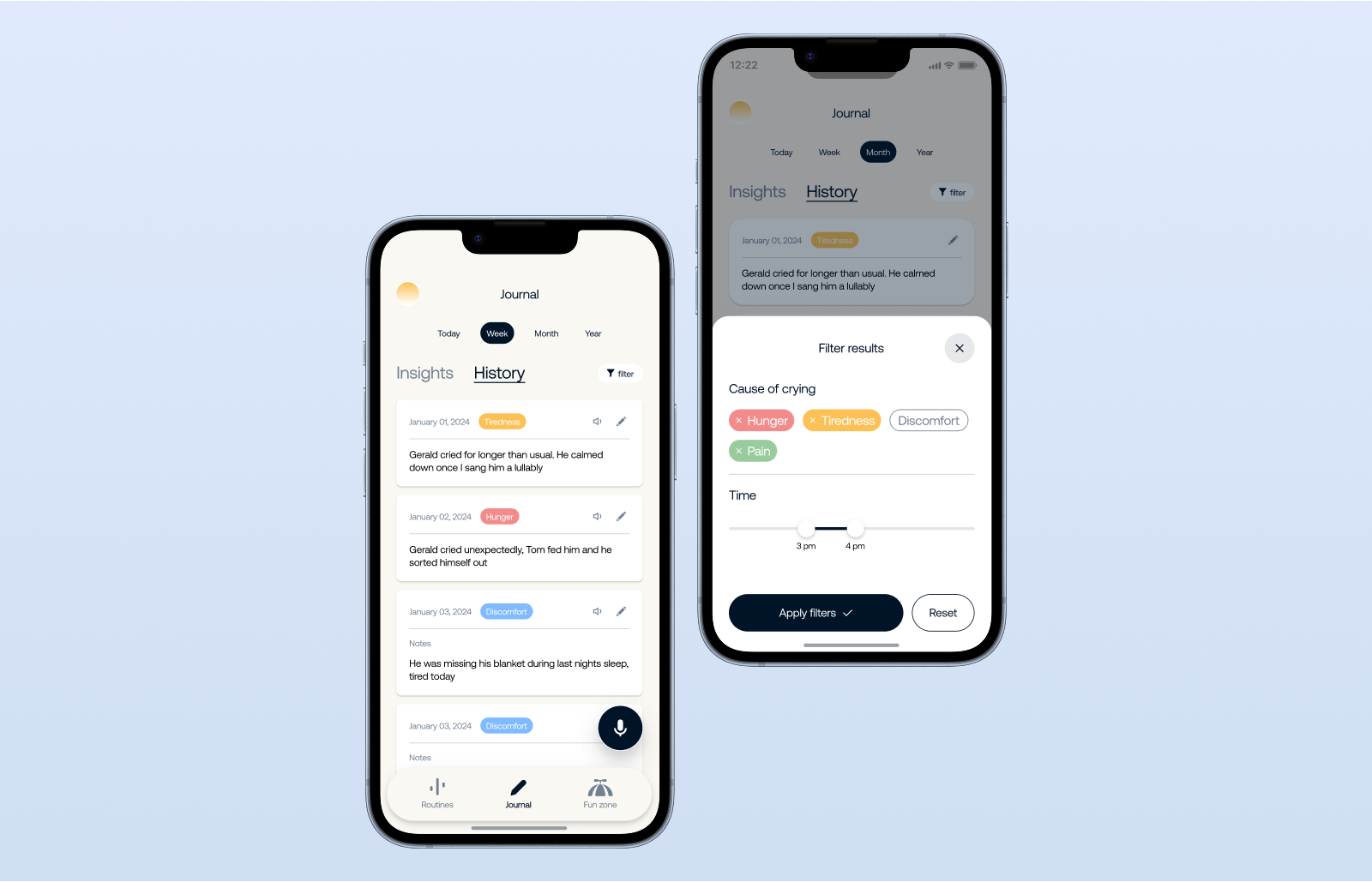
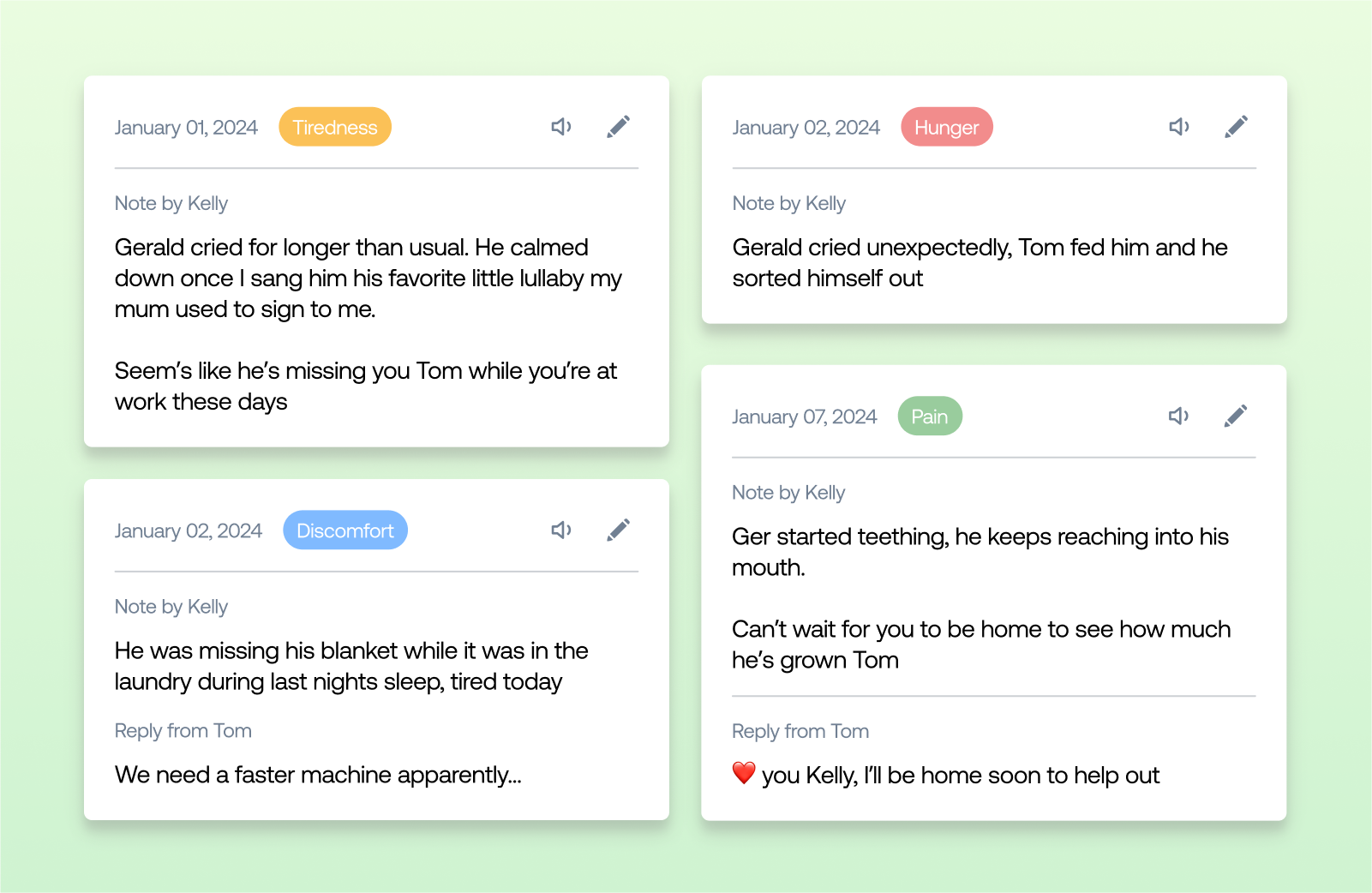
Journal : History
A filterable history of all recorded cries or events. Visible by other caregivers for
posterity and support.
Results
12 million
Downloads
4.7/5
Stars rating
#62
Health app worldwide
